Monday 29 October 2012
Weekly Update - 29/10/12
Crap, I haven't blogged at all this week, luckily there's still stuff I can yammer on about outside of that!
UPCOMING ANIMATIONS
I'm finally out of the creative block, so I can now list the animations I'm (back to) working on:
My stuff
Oddball: Barrels
I've been out of Oddball for a while, so I really need to work on a side episode to get used to the style again. My animation style has changed somewhat over the past month so I need to see how I can mix this in with my old techniques. I'm doing it on a side episode rather than cock up the fourth chapter.
"Vampire Pixel" promo
A promo for a new series I'm starting in 2013. Now that I've capped Oddball at eight episodes (canon) I'm thinking about the show that I'll work on after it's done. I'm wanting to get a promo out for now so people can think about it. You can also audition for the characters here
Other stuff/ commissions
Royal Armouries Project
This project is for University, it's still in the hands of the producer, but I'll be taking up my role as lead animator pretty soon so I'll be hard at work for that, deadline is around Christmas.
Solrac Ventures
I'm working on a show for Solrac that he'll be premiering at Equestria LA on November 3rd.
Nick Basile Radio
I have commission information on my Deviant Art, and this is the current one I'm working on, you can find some shows on itunes Once Solrac is finished, this one takes priority as it's the only paid one out of these, and I'm a broke ass student.
DONATIONS
As I said above, I'm pretty broke at the moment. I didn't just want to resort to asking for money to help fund my videos, so I've come up with something I wanna try out. I'm thinking of doing something similar to kickstarter, where you donate x amount and get a reward, like a cameo or billboard advertisement in an animation. I asked on Deviant Art and the idea seemed to go well, so I may have a trial soon to see how it goes. This way I'm not just outright asking for money, it's totally voluntary and I at least give something back.
Also, I'm back on Tumblr, if that's important. This time I'm focusing on just posting my art work, rather than reblogging tonnes of Pokemon gifs like my last account.
I think that's it for this week, so I'll leave you with the question of the week:
QOTW: What would you like to see next, Oddball or the Vampire Pixel promo?
Friday 26 October 2012

Saturday 20 October 2012
[Drawing] Lily character rotation
One of my tasks as the animator for the Royal Armouries project was to create a turnaround for our mining character. I decided to take it further and animate a 360 cycle rather than just drawing them down as an image. This worked so well that I decided to try it out with my new character builds. Seeing as Lily is the most developed so far, I decided to go with her. The style worked just as I'd hoped, the build of basic shapes made posing and drawing the other angles a lot easier. This will come in handy later down the line when I get onto the over the top action scenes I'm hoping to incorporate. Making this rotation also showed me that her old hairstyle with one side over her eye was rather difficult to draw from other angles, so after a talk with a classmate, I decided to have one side loose and the other behind her ear. All in all I'm satisfied with the character build and I now have enough information on proportions and angles to draw and animate the more complex scenes. After this was done, I finally came up with a surname for her which I think suits for several reasons. I chose the surname "Lavender" because of the following reasons:
- Old cartoons and comics often used alliteration for their character names, for example Timmy Turner, Bugs Bunny, Mickey Mouse, Fred Flinstone, etc. This adds another tribute to the retro style I'm taking inspiration from.
- Lavender is purple, Lily's theme colour is purple.
- It's a reference to one of my favourite things, Pokemon. In the first games, there is a town called Lavender Town which is infamous for its creepy atmosphere and music:
- Lavender town is also associated with ghosts, which ties in with the paranormal themes in this animation such as banshees and demons.
- Lavender and Lily are both plants.
I find it extremely satisfying when things fall in to place like that and link together nicely. I'd say Lily is nearly complete as a character now.
[Drawing] Brought to life pt.1
THE CLASS
Nothing in a morning can prepare you for a face full of naked. Nothing.
Nevertheless, we are now back onto life drawing in our second year so this post will be about the class and what I take from it.

The first picture we drew was a basic, 15 minute pose using pencil. Having a simple introductory pose like this is a big help to push past the awkward situation. After this pose, we were told to write three positives and three negatives. With work like this, I have a hard time praising myself as I know I'm a lot better drawing from imagination than observation. My three negative points were:
- Wrong proportions. The legs seem way too long
- Stubby arms. I had trouble trying to foreshorten the arms to match the pose.
- LEARN TO DRAW FEET. I'm always bad at drawing feet, simple!
I only managed to come up with one thing I liked, and that's that I built it up from basic shapes first, but seeing as we only had 15 minutes, I didn't have much time to think carefully about it. To help cheer myself up, I drew little comical doodles next to the drawings.

The next bunch of pictures we had were all experimental. This sort of work really bugs me at first as I obsess over tidiness whenever I draw,so to have something messy such as the set of pictures above makes me snap.
TOP LEFT
This first picture was using pen only, which meant I couldn't hide any of the construction work as I normally do. Due to this, I found my work geting progressively looser and less structured as the pictures went along, relying only on my hand/eye coordination instead. I think this pose was only 5 minutes, so all I could get down was a gesture line and a rough of the body.
TOP RIGHT
This next picture was done with one continuous line. A lot of the time on this one was looking at the model, rather than the paper and the lines are a lot rounder with less attention to detail.
BOTTOM LEFT
This drawing was done with my left hand. I hate drawing with my left hand. I think during this one I was more focused on keeping the pen moving properly that I payed less attention to the model, which is the opposite of the previous picture. The proportions are way off and the overall pose is just sloppy. However, for my left hand, it's not as bad as I thought it would be.
BOTTOM CENTER
This drawing was done holding the pen by the nib, and pointing it directly down. This was possibly the most disorientating of them all as I wasn't paying attention to the model or the picture, but the pen itself. I couldn't see the marks my pen were making as my hand obscured the nib, so it was a "draw of faith" so to speak. The result; an alien life form taking a squat in the bushes...
BOTTOM RIGHT
The opposite of the previous picture, I had little control over the pen this time as I was holding it by the top. Again, I was more focused on the way I was holding the pen than worrying about accuracy. The top half was half acceptable, but I was drawing a lot slower and had to rush the legs to get them complete in time.

The final bunch of drawings, three of which used a medium I really dislike, charcoal.
These three seemed to focus more on the negative space rather than the model. I did however, like one of these. For two poses we coloured the paper black and used an eraser to take out the negative space. The first one I did (the full body) I actually enjoyed. The picture had me focusing on the form rather than just the outline as my drawings often are so it was a change that actually helped.
We finished up the lesson by doing what was in my opinion, the best part of the session for animators. We drew a series of 30 second poses to see how quickly we could draw them down. The end result is a continuous, Muybridge like sequence of images showing the model going from a crouching position, to walking, and crouching again. This was good practice for gesture lines too as well as simplifying the build of the human body.
THE HOMEWORK
After drawing class, I wanted to see if I could apply anything from the first session to my own work. I previously stated that I draw better from my imagination than observation, so hopefully I can back that statement up in this part of the entry.
As a warmup, I drew this picture live, there are a lot of errors with it, bad composition, a weak pose and poor light balance, but this was just to get back into the gist of drawing cartoons again rather than people.

You can watch a recording of the stream below:
The second image I made turned out a lot better:

This image was intended to show the darker side of the city I'm creating, as well as showing the personality of "Lily" a little more. I tried to make the city look darker while keeping the vibrant feel to it. I think the costume change on Lily to a hoodie and gloves helped create the atmosphere a bit more too, but these aren't the important parts for this post.
It may not look it, but I had to think a fair bit about how this pose would work. I rarely include a character's full body in a shot, and I also rarely draw from a rear 3/4 angle, but I wanted to test myself with this one.You can see the drawing of it below:
Drawing this, I noticed that I was thinking more about the physical space that the character takes up, and how they relate to the perspective in the picture, I even drew a grid on the "ground" to decide how the hands should be placed.

Sunday 14 October 2012
[Drawing] Monster designs


I've started designing some enemies for my new animation, I tried to make them match the city by including bright neon lights. I wanted to include zombies, so I found a way around this. Seeing as the madness seems to happen at night when the neon lights are on, I had the zombies as late night clubbers wearing glowsticks. This also let me put some stereotypical designs on them to give them more personality.
[Casting] New voice auditions


Above is a sample of how I cast for voice actors in my voice hub, I've provided concept art, character information and demo lines. I also have a slide with a brief overview of the show and a slide at the start telling people how to audition and where to send them to. I like this approach as it feels a lot more interactive and friendly than just text on a forum.
Wednesday 10 October 2012
[Uni project] Armouries pt. 1: Starting up
For the first project of the year, we are creating an animation for the Royal Armouries in Leeds, going through the pitching process before the final production.
For this project, I'm teaming up with Jack and Will.
I chose to work with these two as we all have experience in using Flash, which is the main program for this project. We each have a role that we want to get practice in with this project too, Jack has recently taken a liking to background design, and Will has taken a preference to the developing and producing aspects of animation. As for myself, I have an interest in character animation, so I'm doing the lead animation on the project.
Before we broke up for summer, we were each given a booklet containing a number of briefs, we chose to meet a brief for the Royal Armouries. The brief was about arms and armour not just being made as weapons, but as decoration and awards. We found an interesting helmet to base our animation around, which I will write more about in the next entry.
Below is a concept for our art and animation style, using simple characters is a big help to my character animation practice as I can focus more on the movement and shapes rather than the fine details.
As for the art style, we agreed on a high contrast style with silhouetted characters. The reason behind this is that it allows us to focus the viewers attention on certain characters or objects by making them contrast more against everything else.
Tuesday 9 October 2012
[Animation practice] Early animation test: Dash cycle
Since my new show I have planned will have a lot of action, I thought I'd try out the basics with the style to get used to it. I've found that as the shapes in this style are much stronger, it helps to emphasise them, so the leg stretches out further forward than normal to compliment the straight lines and give the pose more strength. This is also the first time I've adapted a run cycle to the situation, rather than having a standard type, her strides are bigger as she's super powered and she also runs much faster than any normal human could, so the custom cycle is exaggerated.
Monday 8 October 2012
[Drawing] Character maps
Today I thought up a new way to translate a character across to a first time viewer. I've created a series of images with the character in the centre and then a splatter around them showing their interests and character points;


These pictures are somewhat similar to an art style I got into in college, which was filling the page with a bunch of small drawings.
This free flowing creation really gets my imagination going and I can literally see the characters positive and negative aspects, for example the blonde character who is all about popularity (as shown by the crowd of girls) or the geeky girl who has a move vivid imagination but is chained to electronic devices, which is shown by the plugs in the picture.
Also, speakers.
Sunday 7 October 2012
[Commission] The Kangaroo
The kangaroo... How could I possibly forget the kangaroo in this blog... Apologies in advance for any lapses in professionalism in this post but... THAT KANGAROO!
Early in our first year at University we were asked to help out with a third year film student's final project. The "we" being Jack, Will and I who are working together on the Royal Armouries animation. As we were just starting at University, we thought taking the request would be a good opportunity to branch out and get some experience working together in a team as we are all like minded and competent in Flash.
Unfortunately, the rest of the project could have been organised better by this confused space cat:
 What I'm trying to say is, the project was very poorly put together, meetings would start, the client would talk about Teenage Mutant Ninja Turtle Pizza Parties for half of it, give us a piece of paper with our shots on and no other information, then boot out. Confusion started to arise in the animation team and we started to regret joining the project.
After a few weeks of this, we are met to one pissy client telling us that all our shots are wrong and we're a week or so away from release, as if it's our fault. Now, I can tolerate grumps, and I can understand people being stressed over deadlines, after all, I'm Mr. Overworker myself sometimes, but when they go as far as to insult my friend over something that's their own fault, there's a line.
After this meeting, the three of us decided among ourselves to leave the project. I know this had a huge risk of making us look like the bad guys, but when there was more organisation put into the bbq at the launch party than the animation team, the project really wasn't worth saving.
This animation was another to add to the history of bad clients, and lead me to appreciate this website.
Anyway, without further ado, I present to you the final piece, the shots I was given were mainly closeups, enjoy!
Also, ".mov"
Early in our first year at University we were asked to help out with a third year film student's final project. The "we" being Jack, Will and I who are working together on the Royal Armouries animation. As we were just starting at University, we thought taking the request would be a good opportunity to branch out and get some experience working together in a team as we are all like minded and competent in Flash.
Unfortunately, the rest of the project could have been organised better by this confused space cat:
After a few weeks of this, we are met to one pissy client telling us that all our shots are wrong and we're a week or so away from release, as if it's our fault. Now, I can tolerate grumps, and I can understand people being stressed over deadlines, after all, I'm Mr. Overworker myself sometimes, but when they go as far as to insult my friend over something that's their own fault, there's a line.
After this meeting, the three of us decided among ourselves to leave the project. I know this had a huge risk of making us look like the bad guys, but when there was more organisation put into the bbq at the launch party than the animation team, the project really wasn't worth saving.
This animation was another to add to the history of bad clients, and lead me to appreciate this website.
Anyway, without further ado, I present to you the final piece, the shots I was given were mainly closeups, enjoy!
Also, ".mov"
Saturday 6 October 2012
[Drawing] Next steps in drawing
Something I've noticed in a lot of my past works and part of the feedback from Oddball was that my staging is very flat. To counter this, I'm going to be getting a lot more practice with perspective and also in shot composition. The new art style I'm practising allows for this sort of style.
Below is a test shot I made. I also want the city in this animation to have a neon feel to it so I can play around with light in the crazy shots.


Below is a test shot I made. I also want the city in this animation to have a neon feel to it so I can play around with light in the crazy shots.


Also cats.
[Drawing] Back to the drawing...class...
After a booooring 13 weeks at home I'm finally back at University, so this blog is going to be updated more frequently again. First up: Drawing class.
This year, we have a new tutor so classes are slightly different. So far we've had a lot of focus on group activities and not just on the drawing, but expanding our imaginations too. While at a glance this may seem somewhat juvenile, it's extremely important to animators as creativity and freedom can be key in certain lines of work. I'm currently in the process of planning a new show (which I'll mention later in this post) so at this point, these lessons have been extremely useful to me. So without further ado, I'll sum up the first three drawing lessons:
As an introduction activity and to get back into the flow, we worked on paper with ink and sticks. This encouraged neatness and focused on the mark making rather than what we were actually drawing. I'll upload a scan of my first piece later on, but from what I remember, I was sticking to basic shapes and things I knew, which defeated the object of the lesson. I think a part of me was still conforming to tidy work rather than creativity, This showed through even more in our pairs activity when we took it in turns to add to the picture we worked on, the picture below will explain for itself just how that went:

To sum up the lesson, I need to learn to loosen up a bit more and let my mind take over, rather than stick to boundaries.
This lesson, I really enjoyed. The lesson was split up into several stages, each more crazy than the last, at the start of the lesson we had no idea what we were getting into.
Our first task was to name things that you'd find in a conventional city, post boxes, police stations, schools, etc. Once that was done, we were to draw one down, then pass our picture to the next person to add to.
We didn't end up with a "conventional" city at all.
By time we'd done a full rotation, our cities ended up having the creative juices of the whole class splattered all over them. Flaming pandas, Twix eating aliens and Safety Gnomes (had to!) were just a small selection from the madness we had collectively created.
Our next part of the lesson was spent joining these pictures together. Due to the fact we had no idea this would happen at the start of the lesson, the perspective on all our pictures was radically different, so we had to really think how to put everything together seamlessly. After some extensions to the skyline, road layouts even worse than those in Leeds and a touch more fire, we had a consistent city.
The final part of the lesson was the most risky. After having bad experiences with art teachers "adding" to work in school, I was somewhat worried when our next order was to cake the whole picture with a layer of charcoal shavings.
I was mistaken.
After doing this, we were handed an eraser each to add lighting to the image. To put it in an amusing way, the flying spaghetti monster hovering above the city now had a majestic glow that engulfed a third of the whole city. The result was *wipes tear from eye* beautiful.
I will soon be uploading a picture of all the backgrounds joined together, but for now, here's a placeholder segment:


This year, we have a new tutor so classes are slightly different. So far we've had a lot of focus on group activities and not just on the drawing, but expanding our imaginations too. While at a glance this may seem somewhat juvenile, it's extremely important to animators as creativity and freedom can be key in certain lines of work. I'm currently in the process of planning a new show (which I'll mention later in this post) so at this point, these lessons have been extremely useful to me. So without further ado, I'll sum up the first three drawing lessons:
Lesson one: Creative Inkling
My main flaw when working on paper is that I have an obsession with tidiness, my lineart has to be perfect. Not in this lesson.As an introduction activity and to get back into the flow, we worked on paper with ink and sticks. This encouraged neatness and focused on the mark making rather than what we were actually drawing. I'll upload a scan of my first piece later on, but from what I remember, I was sticking to basic shapes and things I knew, which defeated the object of the lesson. I think a part of me was still conforming to tidy work rather than creativity, This showed through even more in our pairs activity when we took it in turns to add to the picture we worked on, the picture below will explain for itself just how that went:

To sum up the lesson, I need to learn to loosen up a bit more and let my mind take over, rather than stick to boundaries.
Lesson two: Living in chaos
Our first task was to name things that you'd find in a conventional city, post boxes, police stations, schools, etc. Once that was done, we were to draw one down, then pass our picture to the next person to add to.
We didn't end up with a "conventional" city at all.
By time we'd done a full rotation, our cities ended up having the creative juices of the whole class splattered all over them. Flaming pandas, Twix eating aliens and Safety Gnomes (had to!) were just a small selection from the madness we had collectively created.
Our next part of the lesson was spent joining these pictures together. Due to the fact we had no idea this would happen at the start of the lesson, the perspective on all our pictures was radically different, so we had to really think how to put everything together seamlessly. After some extensions to the skyline, road layouts even worse than those in Leeds and a touch more fire, we had a consistent city.
The final part of the lesson was the most risky. After having bad experiences with art teachers "adding" to work in school, I was somewhat worried when our next order was to cake the whole picture with a layer of charcoal shavings.
I was mistaken.
After doing this, we were handed an eraser each to add lighting to the image. To put it in an amusing way, the flying spaghetti monster hovering above the city now had a majestic glow that engulfed a third of the whole city. The result was *wipes tear from eye* beautiful.
I will soon be uploading a picture of all the backgrounds joined together, but for now, here's a placeholder segment:


Lesson 3: Corn Boy VS The Panda Empire
Returning to the glory of our city (now named Poland) our task for lesson 3 was to create a citizen worthy of a presence in our conglomerate brainchild.
Enter Corn Boy
I went to expand my retro art style with corn boy, making his body up of very basic shapes, I also thought about how he'd move, which I imagined to be very loosely and exaggerated, so I added a swinging corn from his hat to add secondary motion. To amuse ourselves while drawing, a few of us shared our characters' back stories with each other. Corn Boy lives in the Corn Shop in Poland, where he sells Twix bars. Jack (CurlyPanda) created a Panda for his character, and decided that his Panda hates corn.
Our back stories meshed, and when the second part of the lesson started, it showed.
For part 2, we had to draw the city from our character's point of view, our versions of the city both had propaganda posters against the opposing faction. The goal of getting our imaginations running has certainly pulled off so far, and I've started to break away from the problems I had with the first lesson.
OUTSIDE CLASS
As mentioned earlier, I'm starting to think up ideas for a new show to carry on after Oddball ends. So far I've been working on the characters and art style. To help buff my skills, I've started a 100 pose challenge with the new trio to try out the dynamic new art style. Below are some pictures from the challenge so far:
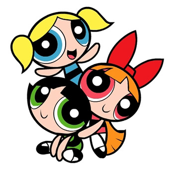
As it may show, I'm trying to take a more retro direction to my art style, sticking to strong, basic shapes. It goes a lot without saying, but my influences are old Cartoon Network shows I watched as a kid, mainly the Powerpuff Girls.
I learned recently that I'm missing out with my current art style for Oddball. I don't have much focus on lines and curves, which can make animation emphasis a lot stronger, so my aim for this style is to have something a lot stronger, and more dynamic. From my pose tests, I'm already getting a feel for that. Below is an image that shows the development from the original concept idea:
After making this, two friends pointed me towards a cartoon, Panty & Stocking with Garter Belt, which I've watched a short clip of before, but nothing more. I decided to watch every episode for inspiration as it has a very similar art and animation style to what I want to accomplish with this new show, below is an example:
I'm not planning to start proper development on this show until 2013, I'm just getting practice with the art style for now as I have Oddball to keep me busy.
Aside from that, I've been trying to emulate other art styles too, for example Adventure Time:
I've found that copying other art styles is a great way for me to learn, so practice like this is likely to happen again.
I think that sums up this dragged out entry anyway!
[Personal project] Crusadin'
As active followers will know, I've been swept along into the Brony hype, so it was inevitable that I ended up emulating the animation style of the show. After watching several animation deconstructions from the show, I found myself some model packs and started work.
A huge part of the community for the show is the fan made music and remixes, one of which I decided to work with:
The animation style for the clip I created was very different to how I normally work, so naturally it was a huge learning curve for me. Rather than drawing everything onto the stage, the symbol based animation had me using a lot of graphics and tweens to construct the motion. The model pack I got only had one basic pose, so I had to copy down a lot of angles and components from screenshots of the show itself. Below is the final short clip:
A huge part of the community for the show is the fan made music and remixes, one of which I decided to work with:
The short attracted a lot of attention from the community, getting me over 10000 views, which was a huge boost compared to my other, less known videos on YouTube. It also attracted attention to my other animations too, as well as getting a lot of requests for the full video that I will eventually be making. Finally, I got an offer to work with someone on an animation that will be shown at a convention, which will again, be a huge help to my publicity. The thing I'm most satisfied about however, is breaking out of using one particular animation style, and no longer being a one trick pony.
What a better way to sum up a post than on a terrible pun!
[Personal project] A look back at Oddball pt. 1: Pre-production
Oddball chapters 1-3 have finally been compiled into the first Omnibus episode and released on Newgrounds. I think now is the best time for me to look back at the development of the whole project and have some reflection on it. Prepare for a long post, I'm going to try and get as deep as I can into the creative process.
A year ago, I released a Halloween animation starring Redi and Antique, the two protagonists for the Oddball series. As this was their first animated appearance, people were naturally asking about their background, as one had an 8 ball for an eye, and the other was a talking clock/bear. This generated some interest in the characters as well as getting me a winning place in the Halloween contest on Newgrounds (yay, money!)
To me, this was a good start for the series, so I started thinking about the actual origins for the two characters to satisfy people's answers and also delve deeper into the world I'd created. I started by explaining Antique, I already had some idea about him being in charge of Redi's lifespan so I just developed that more until the Timekeepers were created.
Quick side note about Timekeepers. When I was younger, on my birthdays my Dad would hide my presents and give me a piece of paper with a riddle on it, I'd follow that riddle to another clue, and so on, until I found my presents. One of them was pointing to a clock, the clue was something like, "I have a face, hands, but no body". In a way, I guess my Dad was responsible for creating the Timekeepers.
Moving forward to 2012, I started writing the first draft of the story and running it by my friend Jack, who has now become a co-writer for the series. At this time, the show was made fully in Flash. I later moved onto After Effects as we had used it in the Flow project and I was keen to get more practice with it. AE let me create the snow effects in the show with ease, and also make my backgrounds a lot better with the inclusion of textures and better lighting.
After some time, I'd finished a rough version of the animation in Flash, with the original story that had some tweaks later down the line. You can find the original version here
A few members of the cast were already picked, but I had to do a lot of casting for this episode too. From past experiences, I knew of a few approaches. Seeing as this project was so big, I took them all. Newgrounds voice acting forum post, voice acting allience threads, direct contact with people, and a new method I created that has proved extremely beneficial, my own voice acting hub.
I often get messages from people asking when I'll have voice roles open, so I created a flash file including demo lines for any characters I have open for auditions, this has been a huge success and also smoothed out the process too. I included a set of instructions at the start of the file covering things like contact details, microphone quality and file format. Now that those are included, I get a lot less untitled files and such. Although people who were serious voice actors already knew these things, I still think it's fair to let less experienced people have a chance.
Now armed with a team of voice actors and a rough guide to the animation, it was time to start the animation properly. I will cover this in a future post, for now, here's a video of 10 hours of animation work sped up, just to show the time that goes into these videos. Ironically, I've been told by people who watch my Livestreams that I'm working at a fast pace too.
A year ago, I released a Halloween animation starring Redi and Antique, the two protagonists for the Oddball series. As this was their first animated appearance, people were naturally asking about their background, as one had an 8 ball for an eye, and the other was a talking clock/bear. This generated some interest in the characters as well as getting me a winning place in the Halloween contest on Newgrounds (yay, money!)
To me, this was a good start for the series, so I started thinking about the actual origins for the two characters to satisfy people's answers and also delve deeper into the world I'd created. I started by explaining Antique, I already had some idea about him being in charge of Redi's lifespan so I just developed that more until the Timekeepers were created.
Quick side note about Timekeepers. When I was younger, on my birthdays my Dad would hide my presents and give me a piece of paper with a riddle on it, I'd follow that riddle to another clue, and so on, until I found my presents. One of them was pointing to a clock, the clue was something like, "I have a face, hands, but no body". In a way, I guess my Dad was responsible for creating the Timekeepers.
Moving forward to 2012, I started writing the first draft of the story and running it by my friend Jack, who has now become a co-writer for the series. At this time, the show was made fully in Flash. I later moved onto After Effects as we had used it in the Flow project and I was keen to get more practice with it. AE let me create the snow effects in the show with ease, and also make my backgrounds a lot better with the inclusion of textures and better lighting.
After some time, I'd finished a rough version of the animation in Flash, with the original story that had some tweaks later down the line. You can find the original version here
A few members of the cast were already picked, but I had to do a lot of casting for this episode too. From past experiences, I knew of a few approaches. Seeing as this project was so big, I took them all. Newgrounds voice acting forum post, voice acting allience threads, direct contact with people, and a new method I created that has proved extremely beneficial, my own voice acting hub.
I often get messages from people asking when I'll have voice roles open, so I created a flash file including demo lines for any characters I have open for auditions, this has been a huge success and also smoothed out the process too. I included a set of instructions at the start of the file covering things like contact details, microphone quality and file format. Now that those are included, I get a lot less untitled files and such. Although people who were serious voice actors already knew these things, I still think it's fair to let less experienced people have a chance.
Subscribe to:
Posts (Atom)